Sometimes a picture is truly worth a thousand words.
In the case of the rapidly rising rate of solar installations for electricity generation, numerous forecasts by internationally respected bodies have proven woefully conservative.
The chart in the tweet below, created by Auke Hoekstra at the Technical University of Eindhoven, The Netherlands, shows it better than words ever could.
DON'T MISS: Big energy hugely underestimates electric cars, renewable power
He first tweeted it in mid-May, and it quickly made the rounds of Twitter's renewable energy circles.
Hoekstra simply looked at successive revisions of predictions by the International Energy Agency's World Energy Outlook for solar adoption, measured in gigawatts of capacity added per year.
The data starts in 2002, and now carries through the IEA's latest predictions for 2017.
EDITOR'S NOTE: We first published this article on May 26, 2017, when Hoedstra tweeted the first version of his chart, using the most recent data then available, the World Energy Organization's 2016 and revised 2016 forecasts for annual photovoltaic generating capacity. He updated his graph on November 18 with the organization's new 2017 forecast, and we have updated this article (and his embedded tweet below) to reflect the latest revision.
2017 UPDATE - The historic track record of solar PV vs the @IEA: reality steeply increasing but the IEA is having none of it. https://t.co/yXzcq5b5WA pic.twitter.com/bayzHyOd5o
— AukeHoekstra (@AukeHoekstra) November 18, 2017
In every case, the agency's revisions raise the starting year to the actual previous capacity growth, but assume that the capacity added in future will continue to be linear, rather than growing exponentially as it has thus far.
Hoekstra said, in responding to comments on the tweet, that he didn't feel the faulty projections were the results of political manipulation by established players in the global energy industry.
Rather, he commented, he'd found that "in my work with other radical innovations ... experts are simply very conservative in their own field."
CHECK OUT: When lauding renewables, look at utilization, not just capacity
"A conservative mindset makes it possible to reject empirical data that suggests radical change," he added.
Others then chimed in: "Experts view progression linearly, while tech quietly doubles and doubles and doubles," said Jess Sloss.
"The human mind has problems visualising the exponential," added Jonathan J. Stedman. "It [is] hard for all of us."
wind's watershed moment https://t.co/9jnbIFvXLl via @axios pic.twitter.com/HaaMW4xwhN
— Amy Harder (@AmyAHarder) May 25, 2017
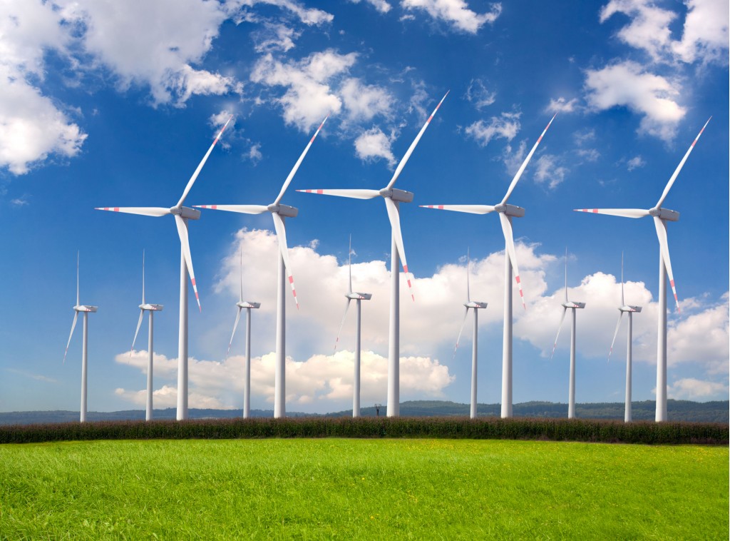
Hoekstra later retweeted another graph, this one from Axios writer Amy Harder, noting that wind generating capacity exceeded that from hydroelectric last year for the first time.
The general tenor of the discussion agreed that wind and solar together will be the two main sources of renewable energy—and that they continue to grow at a pace not yet absorbed by the general public.
We suggest reading all the comments that follow Hoekstra's original tweet, as there are additional charts and analyses of the data using different bases and data sets.

wind farm
As for the faulty projections, it's notable how often the IEA's forecasters have had to revise upward—twice in one year, even—while remaining resolutely linear.
It may be, as another commenter noted elsewhere, an example of Moore's Law.
More to the point, as commenter Rowan Simpson tweeted in response, "It should be mandatory for every graph showing future technology predictions to also include track record of previous predictions."
Forecasters, take note.
_______________________________________


