infographics
-
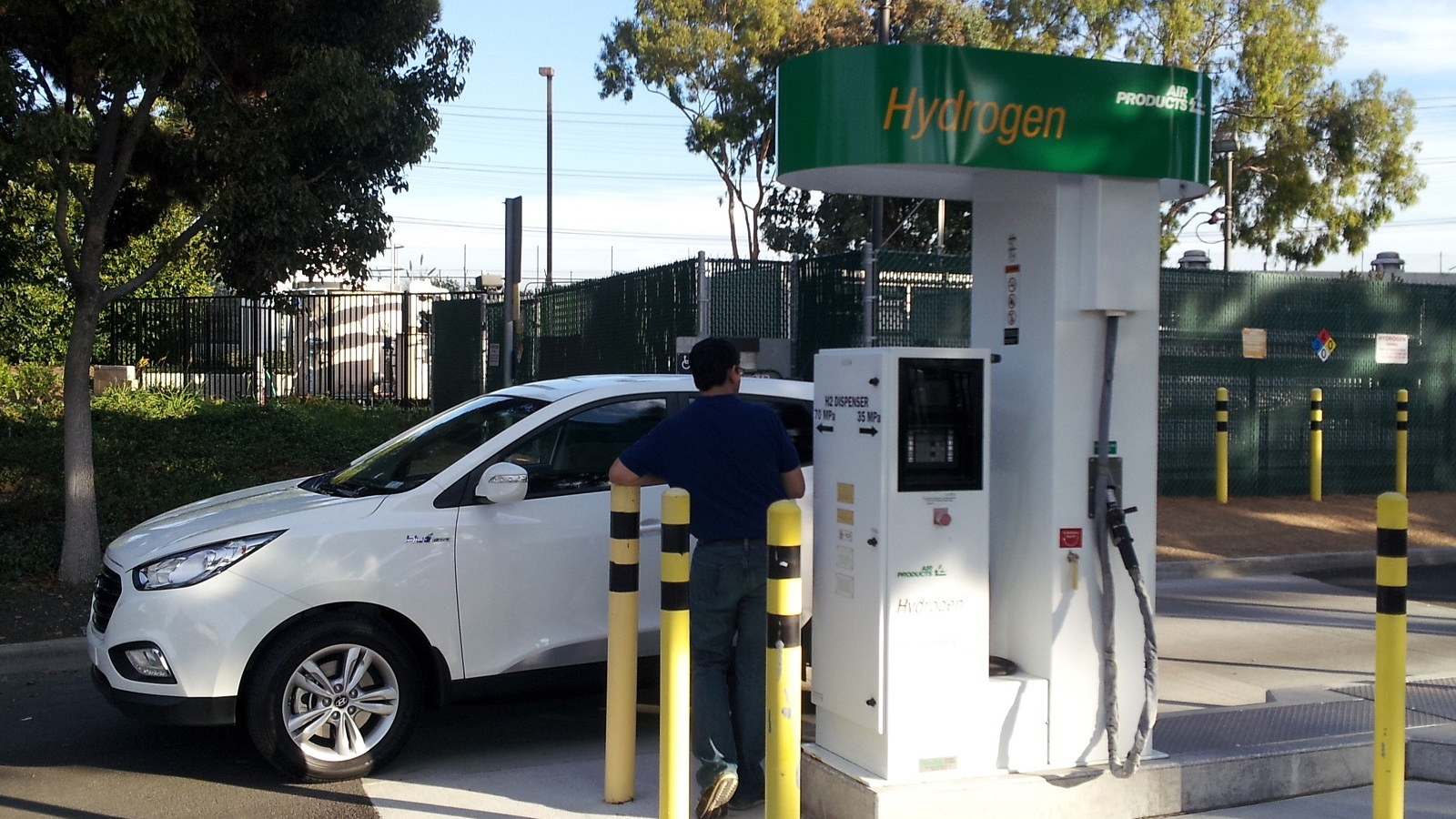
Designing, engineering, testing, producing, and selling cars run by anything other than gasoline engines is hard, expensive, and challenging. Carmakers routinely lose money on the first generation of new technologies--Toyota, for example, with its first-generation Prius hybrid. But while hybrid, plug-in hybrid, and battery-electric cars have had a long and torturous path to market, there's one technology that's taken even longer. DON'T MISS: Toyota Mirai Should Cost The Same As Diesel Sedan Of Same Size, Toyota Says Or as Bruce Lin puts it in his Catalytic Engineering blog: "Dude, where's my...
-
 Where Are Electric-Car Charging Stations? Infographic Shows It All
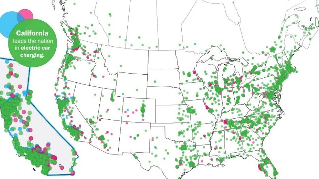
Make no mistake, the market for electric cars might be growing slowly, but it's still growing, and it seems like almost every day there's a new car to buy or concept on the horizon. It's getting easier to charge your electric car while out and about too, as charging points spring up across the...
Antony Ingram -
Greenhouse Gases & Where They Really Come From: Infographic
We love data. And we love simple but informative graphic presentations of complex data even more. Which leads us to today's infographic, a presentation of the sources and activities that produce greenhouse gases as a result of human activity. Inspired by an earlier similar graphic from 2005, the...
John Voelcker -
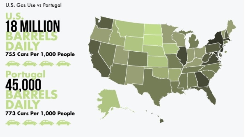
How Much Oil Does America Use? Check Out This Infographic
The rate at which we use fuel even on an individual basis can be pretty surprising. If you do just 10,000 miles per year at 30 mpg, you'll use 333.3 gallons in a year. That's around 2,800 pounds, or the weight of a small compact car--the sort of car that'd do around 30 mpg in the first place. On a...
Antony Ingram -
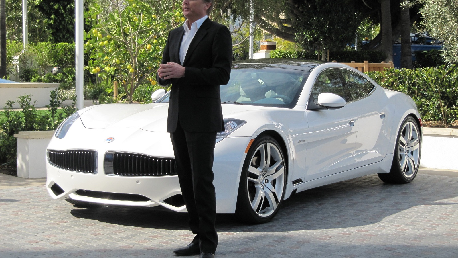
Is Fisker The Most Tragic VC-Backed Debacle In Recent History?
In January 2005, legendary car designer Henrik Fisker founded a company to bring innovative new thinking to the automobile industry. Between that date and today, Fisker Automotive would create perhaps the most beautiful car ever made, raise almost $1.4 billion dollars from investors as diverse as...
VentureBeat's GreenBeat -
E15 Is Coming & AAA Ain't Happy; New Fuel Could Void Warranties
There's a lot of talk nowadays about renewable energy and energy independence. One product of such chatter is a new blend of gasoline called E15, but not everyone is happy to see it coming down the pipeline. Ethanol is a common additive in gasoline, thanks in large part to the Energy Independence...
Richard Read -
We luv us some cheerful infographics, as we often say. Today's specimen comes courtesy of Chevrolet, which is preparing to launch the smallest Chevy it's ever sold, the 2013 Spark minicar. The infographic compares the Chevy Spark to a full-size 1973 U.S. sedan (using data for unspecified "popularly priced" 1973 sedan models from three U.S. manufacturers), and serves up the four following factoids: The 2013 Spark is "50 percent smaller" than a full-size 1973 sedan But the front and rear headroom and front legroom is just as good in the new minicar as in the 40-year-old sedan The driver sits 6...
-
For Your Consideration: A Handful Of Energy Facts To Ponder
It's pretty clear that the United States has absolutely no energy policy at the moment. Attempts at long-term planning to reduce energy use are largely stalled in the toxic atmosphere of no-holds-barred politics, with the exception of tougher gas-mileage rules for 2017-2025 vehicles that were...
John Voelcker -
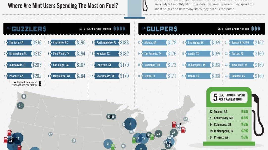
Which Cities Spend The Most On Gasoline? Infographic Maps It
As we've noted before (here and here, for instance), we love a good infographic. So we're pleased that Mint has allowed us to use their map of how much their users spend on gasoline--showing which U.S. cities spend the most and the least on gasoline at every fillup. Their map shows four quadrants...
John Voelcker -
How Does A Hybrid Car Really Work? This Infographic Explains It
As we've said before, we love infographics. Some of our favorites come from AutoMD, which did the one we ran two weeks ago on rising gas prices and simple ways to boost your gas mileage. Now they've tackled the perennial question: How does a hybrid car work? Specifically, they dissect the third...
John Voelcker -
Gas Prices Rising: Driving Tips, Simple Repairs Boost Mileage (Infographic)
We have to admit, we're fond of infographics. This one has three simple parts. It looks at gas prices--which recently rose to an average of $4 a gallon before ebbing slightly--showing national average prices for both three grades of gasoline and for diesel fuel. Then it suggests some driving tips...
John Voelcker
![World Greenhouse-Gas Emissions Flow Chart 2010 [source: Ecofys + ANS Bank]](https://cimg3.ibsrv.net/ibimg/hgm/1117x628-1/100/431/world-greenhouse-gas-emissions-flow-chart-2010-source-ecofys-ans-bank_100431531.jpg)